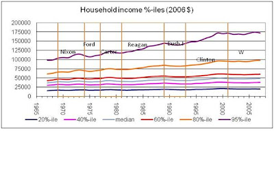
Perhaps owing to my professional training (see bio at right) I'm a big believer in well-interpreted data - which means I like powerful graphs.
Why is this simple analytical tool not more used?
Suggestion: to cut through the bullshit of our political 'discourse', use graphs.
Come to think of it: it's time for me to update my 'household income' graphs!

[i'm guessing our professional pundits figure most Americans are too dumb to grasp the implications of graphs. Having taught statistics for the better part of my professional career, to all manner of students, I believe this assessment is a crock! Maybe the professional pundits are too dumb to grasp a graph, but most normal everyday Americans are not!]
No comments:
Post a Comment